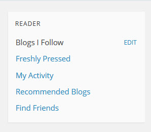
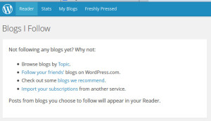
Every now and then I’ll have a reason to visit WordPress.com. I don’t visit the site often so occasionally, I’ll see redesigns that have occurred that throw me for a loop. This is one of those times. 99% of the time when I visit, it’s to login to the dashboard of my .com blog. The old design contained a series of Freshly Pressed posts, a navigation menu at the top and bottom of the website and was generally easy to navigate. However, when I log into WordPress.com in its current state, I’m greeted with a giant road block. This is when I begin the process of looking around the site to figure out where the link is to go straight to the dashboard of my website. The first place I look is the top area of the right-hand sidebar, clicking on links that I think will take me to where I need to go.
Nope, not there. I scroll down the website to find the footer with the links I need and nope, not there either. At this point, I’m frustrated, wanting the old WP.com design back. I start thinking that I’m on the wrong page. I find a way to logout, type WordPress.com into my address bar thinking I’m not on the correct site and once again, a blue page loads. After clicking on every other link on this page, I finally discover that the top menu has a link called My Blogs that has the dashboard login link I was looking for. What angers me about this experience is that I don’t use WordPress.com reader at all yet it’s the default active tab when I login. Most of my frustrations would disappear if instead, the My Blogs tab was activated by default.
It’s equally as frustrating trying to find the official WordPress.com blog. So many wasted clicks trying to find that one stupid link which should be at the footer of the site on every page. I’ve given up looking for it on the site. Instead, I end up going to Google to find it that way. I don’t know who’s idea it was to create some sort of gateway page that is completely separate from the original WordPress.com but it’s like a giant blue obstacle course. The original WordPress.com design was at least consistent.
I want to know if I’m the only one with this type of routine experience with WordPress.com? One things for sure, WordPress.com does a great job at making me feel like an idiot.


I just do my old wp-admin thing on my blog… like when I’m logging into my WordPress.org blog, and that works just fine. :) So I go to http://sitename.com/wp-admin log-in and I’m in my dashboard… no looking around for a button or link.