Amidst all of the conversation taking place on improving the WordPress back-end user interface, there is now a public survey you are encouraged to participate in that will help determine how people use the dashboard and where improvements need to take place. The survey is only 5 questions long but should provide enough information to determine a direction of travel for improvements. For a moment, let’s take a look at the proposed dashboard for the Ghost platform.
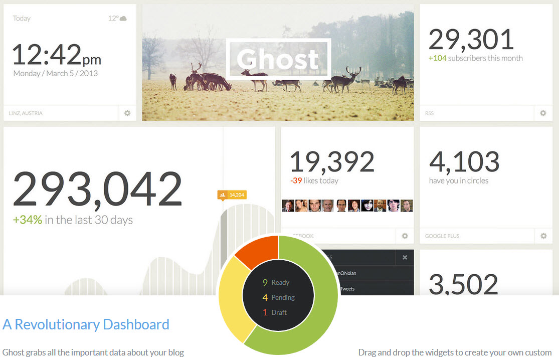
I think a few people, including myself became enamored over the dashboard concept for Ghost but upon looking at it more closely, it’s just a bunch of numbers in my face. Hard to judge something I haven’t been able to play around with but it was nice to see a refreshing take on the entire dashboard concept. In the WordPress Dashboard Survey, I was reminded just how much I don’t use the Dashboard for anything other than getting at-a-glance information. I also realized that if the Right Now meta box included information from some other dashboard widgets like recent comments, recent drafts, etc, that the Right Now box would be more beneficial to me and provide less widgets to be displayed on the screen at one time.
I’m opening up the conversation by asking what is it that would make the dashboard super useful for you? There is an intricate balance that needs to be observed on the type and amount of data that is shown to the user before it becomes information overload or just a bunch of numbers in front of the users face. There is also the problem of creating a dashboard that’s useful to everyone, not just specific use cases of WordPress.
First off, like you, I was surprised to realize just how much I ignore the dashboard. I just glance at it on the way through, checking for news and any comments I might have missed in my email feed.
It would be nice to have selectable blog (RSS, possibly Twitter too) feeds. That way I can alert my customers to changes by setting up their own feed. Stats with trends, and a snapshot of what’s going on right now – how many people are on the site, and where. Yes I can get this by checking out analytics, but it would be much more useful on the dashboard. Being able to drag and drop common menu selections would be a boon, instead of constantly navigating the menus for those few items I use frequently.
How’s that for starters?