In one of the slides for Matt Mullenweg’s state of the WordPress Presentation at WordCamp San Francisco, there was a concept screenshot of the post writing panel. Some of those concepts can be viewed here with the discussion surrounding those designs found on the WordPress UI blog.

There are a number of reasons I’m excited to see all of this transpire. For starters, the WordPress community is finally getting the chance to reshape the direction of the User Interface. That’s not to say that developers couldn’t do that before but by using the P2 site, the commenting section along with being its own separate team, it just seems more inviting to participate versus everything transpiring on core and trac. Also, as far as I can tell, WordPress 2.7 “Coltrane” was the last time the post writing/editing panel received any attention.
The post writing screen is my home away from home. It’s where I spend the majority of my day writing, editing, and managing content. WordPress 2.7 was neat because it added widget functionality all across the board from the dashboard to the post writing screen. Just drag and drop boxes, arranging them in the places that made the most sense for my workflow. I’m a huge fan of things being modular but the more time I spend within the Add New Post screen, the more I want to see widgets disappear and have everything be either 0 or 1 click away. I use a 20 inch monitor and I’m wearing out my scroll wheel to view the categories widget in the sidebar or one of the widgets I have below the editor. This had me thinking about whether anyone had developed a plugin or alternative editing interface that combined the most used widgets into tabs. For example, the editor already has the Visual and Text tabs. How hard would it be to add the Categories as well as the Tags widgets as tabs? I thought it would be a good idea but then I came across the proposed editor by Mel Choyce and hers is so much better than I imagined.
![]()
The most exciting change for me in her redesign is placing the Categories and Tags widget to the bottom border of the post editor. No more having to scroll around. They’re also in a position that matches my work flow. I generally write Post Title, Content, Tag it, then Categorize it. Considering those things are at the bottom of the editor, as well as the Publish button, I’m loving the looks of this interface already. I’m also a big fan of the publish button having its own spot versus being tied in with a widget or hidden in a box of options. While it’s being discussed, I would love to see the need for a Visual/Text tab to disappear. Instead, create the best of both worlds. Not sure if split-screen would be the best approach but I’d like to add code to one side and see the results as they’ll be seen by the public on the other while being able to use keyboard shortcuts in the live preview area as I can in the visual editor. Unfortunately, I think I’ll have to use a plugin to achieve this as I’m pretty sure this won’t be coming down the pike any time soon.
As for the content blocks, I’m not sure I can form an opinion on their use until after I’ve had a chance to use them in practice. In theory, it sounds like a good idea where each piece of content is a lego block and these content blocks are just other legos you can build on top of one another.

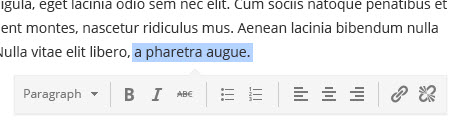
The idea to format text after it’s been highlighted is excellent. The text needs to be highlighted anyways in order to apply formatting so this process enables the formatting bar to get out-of-the-way. Less buttons to see as I’m writing content.
Get Involved:
You are highly encouraged to participate in the conversation on the P2 site where these mockups are located. Overall, I wish I could use Mel’s first concept image as my Add New Post Screen right now! What do you think about the proposed changes to the content creation screen in WordPress?
Post Editor UI looks great and hope it will be available in future releases of WordPress. I fell in love with MP6 and using the same ever since Matt announced it.