January 2014 marked the first month that mobile traffic has overtaken PC traffic on the internet in the US, accounting for 55% of Internet usage. As mobile traffic is on the rise, designing in the browser has become more popular, as it offers better tools for testing sites against various devices.
Responsible is a plugin that adds viewport resizing to the WordPress admin bar with support for six different device sizes. If you’ve ever used a browser bookmarklet in the past to test how a site appears in different devices, the Responsible plugin essentially replicates that same experience within the WordPress admin. It adds a little viewer icon to the admin bar, which refreshes the page with the viewport resizing panel.
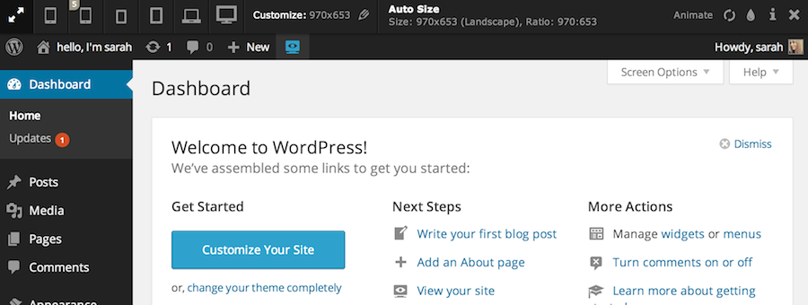
Clicking on the device icons will automatically resize the site, whether in the admin or on the frontend. Below is an example of viewing a website at iPhone dimensions:

Responsible includes the following common viewport sizes for testing, in addition to custom sizes:
- Mobile: 320×480 (Portrait), Ratio: 2:3
- Apple iPhone 5: 320×568 (Portrait), Ratio: 40:71
- Small Tablet: 600×800 (Portrait), Ratio: 3:4
- Tablet (e.g. Apple iPad 2-3rd, mini): 768×1024 (Portrait), Ratio: 3:4
- Widescreen: 1280×800 (Landscape), Ratio: 8:5
- HDTV 1080p: 1920×1080 (Landscape), Ratio: 16:9
If you prefer using the the tool as a bookmarklet, the plugin comes with a filter that allows you register a custom bookmarklet. You can then generate your own bookmarklet using the Viewport Resizer tool.
Responsible is perfect for designing in the browser with WordPress or for some quick responsive testing when you don’t have access to all the different devices. Download it from WordPress.org or add it to your site via the admin plugins screen.
This sounds like a great way of gently nudging a client to think about mobile devices. Their MS Word instincts always seem to kick in and when I go back to perform updates I see they’ve tried to cram as much as they can into a menu or a text widget or whatever, completely forgetting that people will be looking at their site on a phone.