Creating responsive device mockups for products or portfolios can be a pain. Ordinarily, you might first search for a Photoshop template for the specific devices that you need for your mockups. Then you’d most likely take screenshots, cut them up and place them within the Photoshop file.
Fortunately, if your site is running on WordPress, there’s a new free tool that makes it super easy to create device mockups directly within the post or page editor. The Device Mockups plugin uses shortcodes to display screenshots, videos, or any content within a responsive device.
For example, you can surround a screenshot with a device by placing it within the appropriate shortcode:
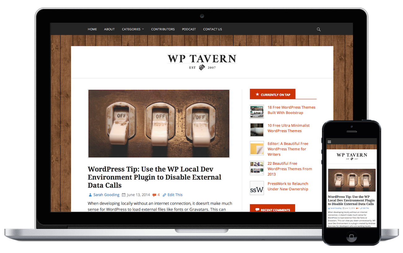
[php light=”true”][device type="macbook"]<img src="http://example.com/wp-content/uploads/2014/06/tavern-screenshot-mbp.png" alt="tavern-screenshot-mbp"/>
[/device][/php]
That shortcode would output the screenshot as if it were being displayed on a retina Macbook Pro:
The plugin even supports a “stacked” parameter in the shortcode so that you can add multiple devices to the end result. You can mix and match devices as needed to create custom mockups.
All of the available shortcodes can be found on the plugin’s details page. You can also access them via a button in the visual editor:
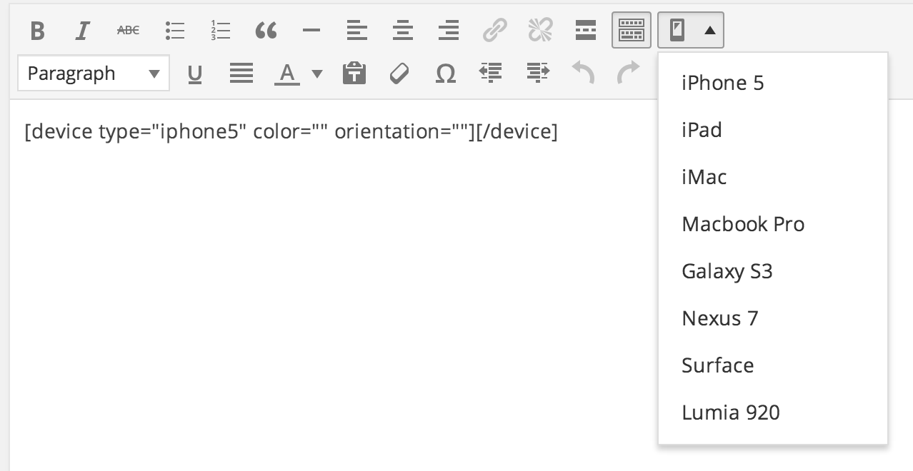
The Device Mockups plugin has support for the following devices, and recommended image sizes are included to help you prepare your screenshots:
- iPhone 5 – 640×1136
- iPad – 2048×1536
- iMac – 1920×1200
- Macbook Pro (Retina) – 1440×900
- Galaxy S3 – 720×1280
- Nexus 7 – 1920×1200
- Surface – 1920 x 1080
- Lumia 920 – 768 x 1280
If you’re looking to create some responsive mockups for your WordPress site or product, then this tool should save you a good amount of time. This is especially true if you’re not well-versed in image editing programs like Photoshop where device mockups might present a true challenge.
If you like the Device Mockups plugin, make sure to thank its developer, Justin Peacock, who has already committed several updates since its release. You can download the plugin for free from WordPress.org. Any issues can be submitted on GitHub.
Nice article Sarah. I can now create stunning previews for my themes.