First Look At The New Plugin Details Screen Coming To WordPress 4.0

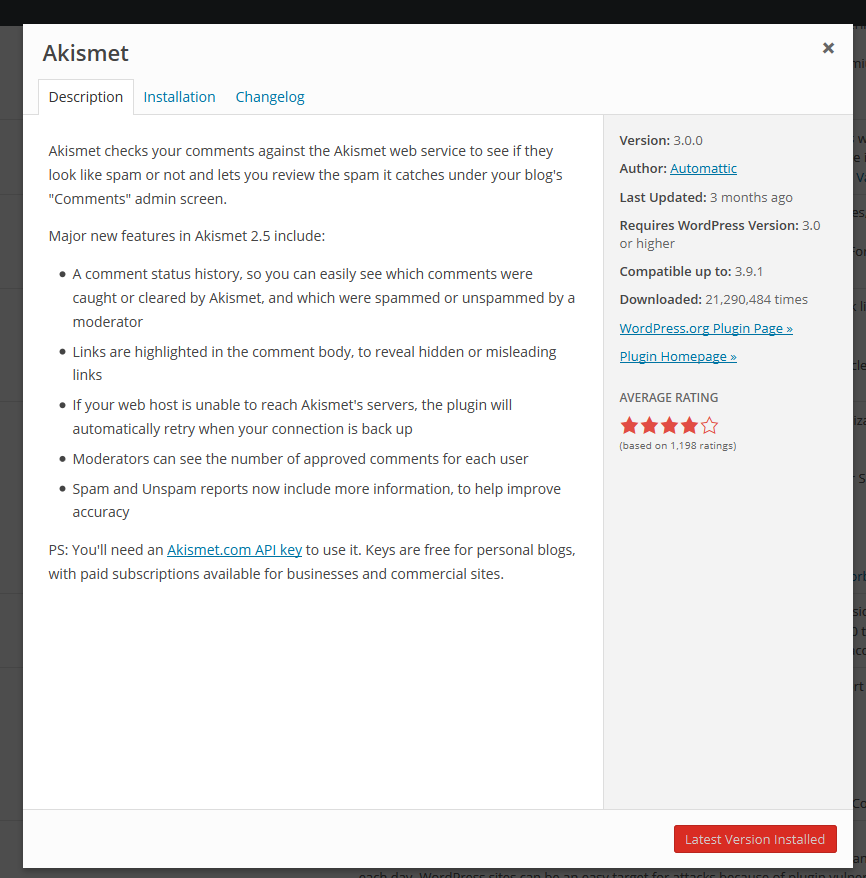
In the past two weeks, a lot of work has been done to improve the various plugin installer modals in the backend of WordPress. A modal is a fancy way of saying a dialog or popup box. One of the modals revamped is the plugin details view. When users click on the details link when searching for plugins to install from the backend of WordPress, a dialog box appears showing detailed plugin information. Here is what the current implementation looks like.

Current Plugin Details Modal View

Here’s what the new view looks like. Keep in mind that it’s a work in progress.

The Detailed Modal View For WordPress 4.0

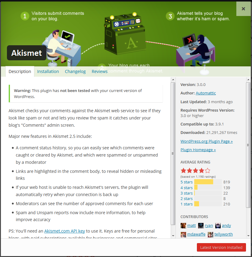
As you can see, the plugin’s banner image is displayed at the top. A reviews tab has been added making it easy to read the latest reviews. In addition to the average rating, you can now see how the average is determined. All contributors to the plugin are listed along with their Gravatars. When the modal view shrinks, the detailed information is displayed above the description text.

I found the reviews hard to read in chronological order because it’s difficult to determine where a review begins and ends. Showing Gravatars is neat but I question their usefulness if they are the size of favicons. Overall, I like the improvements and can’t wait to see what the finished product looks like.

What do you think of the new look?

23

23 responses to “First Look At The New Plugin Details Screen Coming To WordPress 4.0”

  1. More bits requested from a remote server, more load time, potentially more attack surface for malicious users to exploit. I feel it’s more noise (granted beautiful noise) over signal. I just need to know the key details on the plugin and what’s been changed and any possible issues with my WordPress version. The other stuff? Link me back to .org or the plugin developer’s site and explain it to me there.

    • There are 30,000 plugins and themes. It’s incredibly difficult to find the one you want. Sending you to a separate site isn’t a very good user experience, especially when we have a lot of data and information (some of it visual) that can be used to help you make smarter decisions.

      There is no additional “attack surface.”

      • Looking at this some more (and seeing your response – thank you Andrew!) I’m rethinking some of my original analysis and also want to clarify some points.

        I would say that sending people off to another website may not be the best user experience but it *may be* the most appropriate user experience depending on the amount of information that needs to be conveyed and the context that that information should ideally be conveyed in.

        That being said, I appreciate what’s trying to be accomplished in this solution. I like the fact that the plugin detail screen shows all the ratings so you can compare the amount of 5 stars to 3 stars which is more meaningful to me then the average rating. I’m still not sold on the avatars for contributors – I mean it’s visually interesting but it’s not essential information. A name and a link will work just fine in my opinion.

        The biggest issue that I see though is that the problem with the plugin search and detail page now is that it’s more about findability (finding the right plugin and making sure it works with your site) and what I’m seeing here suggests a solution more about making information more visually interesting.

        Thanks for the discussion.

  2. It’s way too busy. Two vertical scrollbars? … The banner is completely unnecessary and doesn’t even properly fit the area as seen in the Akismet example above. The extra info (contributors, reviews) is nice and welcome, but it all could have been done w/o adding extra UI-clutter, image requests, and so on.

    • Finding the right plugin can be incredibly difficult, and is often the most cited problem people have with WordPress. Both smart use of data and visual cues are a major help.

      Keep in mind that hundreds of developers and designers are contributing to every version. This particular was only part-time work of just two of those individuals. Well worth the effort and certainly not distracting from other “more important things to improve.”

    • There are all sorts of things to improve but plugin discovery/install is one of them and that’s whats being worked on by a few individuals in this release. What is more important is subjective but I appreciate and am excited by the changes I’m seeing.

      Currently, the plugin discovery process isn’t as pretty or as informing as it could be. This iteration changes things around a bit to be more intuitive. Just like the Theme discovery/install process, this will get better with future releases but I’m impressed with version 1.

  3. I’ll be the first to say it in these comments apparently, but I am absolutely thrilled by these improvements. Combine the improved install details with the new “card” design, http://screencloud.net/v/opKb, and the plugins section is really beginning to shine.

    Considering that plugins are one of the primary pillars that allows WordPress to power such a significant part of the web, I’m a bit surprised so many people seem to be against these improvements. It only makes sense to make it easier for users to find plugins and understand what they do.

  4. Not exactly the most important thing to change but new WordPress, new looks… A better search in the plugin section that would help find good plugins easier would help web developers. A sorting function for example. Sort plugins by rating, by date last updated. The fancy look slows down the work, especially if you have to work with a slower connection.

  5. The plugin discovery process would improve if the string search process were more liberal with results so that searching under “db manager” would actually find “wp db manager” (which it doesn’t). Also, since there are already download metrics for each plugin, it would be cool to mashup download metrics with an associative algorithm that would produce search results similar to “users also tried these plugins” or “plugins with similar features”. As it is now, the search process is purely alphabetical within the plugin admin, but associative on WordPress.org. Why not combine the two within the admin? (I’m not a top tier developer, so I have no idea what the ramifications of these suggestions might be).

  6. Maybe I’m just being unusually dense for the moment, but how does this help the user make a better decision about what plugin to install?

    Is there additional information being provided in the modal that isn’t being provided in the repository listings? If not, how can this possibly make searching through the 30,000 plugins easier or more informative if the search is combing through the same information at the repository website? If so, why does the modal have better search features and results than the repository?

    It’s pretty, but it’s also something I’ll never use, mainly because I still don’t trust the WP.org installers. It took years for me to finally trust doing updates from the Plugins menu, but for first time installs, I’ll still go FTP for that. Only way to be sure :)

Newsletter

Subscribe Via Email

Enter your email address to subscribe to this blog and receive notifications of new posts by email.