The official WordPress Job board was recently relaunched with a brand new design. Considering the site has existed since 2007 and has not seen very much in the way of upgrades since then, I thought it would be interesting to hear from Scott Reilly and Mel Choyce if there were any difficulties upgrading the site. Mel was involved in the discussions and design portions of the project while Scott did much of the implementation.
What were some of the challenges upgrading from the previous design?
Mel Choyce – I think one of the biggest challenges we faced was trying to bring the site up to standards with the evolving WordPress.org branding. The old site just didn’t feel like it was officially sanctioned, which I think caused some trust issues. When I looked at it, I didn’t really see WordPress. I really approached the design with the concept of, how can we make this feel more like WordPress? How can we make this look more official?
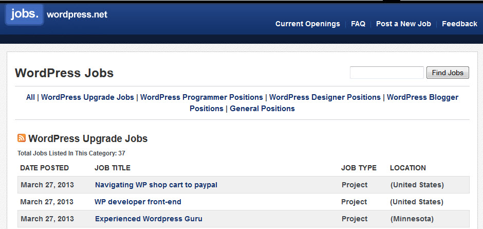
Another part we struggled with was updating the categories. The old categories were a little vague and generic, so we tried to tighten those up to make it easier for job posters to appropriately categorize their jobs.
Scott Reilly – From the technical side of things, for the most part we reimplemented the entire site, keeping mostly just the data. Even then, we migrated and massaged some of the data in the process. But all in all, the technical implementation was fairly straightforward. The biggest challenges were mostly in coming up with a design (Mel) and then forming a team around the project. Heretofore, Mark Ghosh had been pretty much running the site singlehandedly, which was a monumental effort. This included the custom code to run the site as well as the daily moderation of job postings. So we put out the call for volunteer moderators and began to formalize the guidelines.
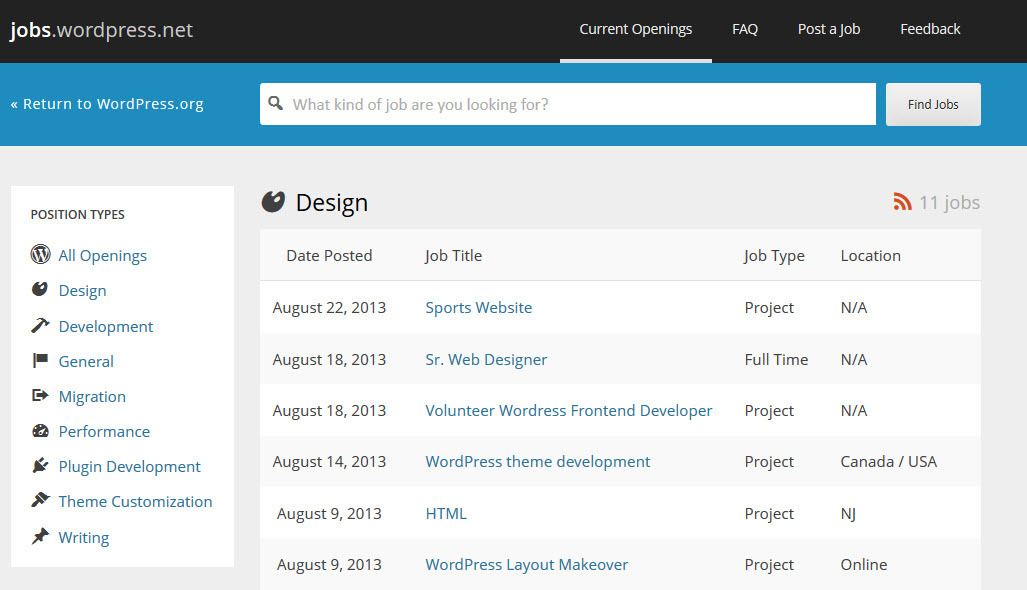
One of the biggest differences between the two designs is the addition of a sidebar of icons that symbolize different position types. By the way, those icons look familiar. Was this approach considered the best way to easily dig into all of the jobs openings available or is this just one method you’re trying?
Mel Choyce – I’m not totally sure what you’re asking? We chose a vertical navigation bar to make it easier to scan for categories. The previous design had a horizontal navigation bar, and there were so many categories that it was just kind of hard to quickly look through it.
We ended up borrowing heavily from the MP6 aesthetic, so the inclusion of icons not only helped reinforce the brand, but also subtly reinforced the meaning of each category. I had made some icons, but they lacked finesse and polish, so I asked Ben Dunkle (lead icon designer for WordPress.org) to play around with some different ideas for each category. I think they ended up pretty slick.
Scott Reilly – The icons are Dashicons: http://melchoyce.github.io/dashicons/, some of which were tweaked or custom-made for the site. While I wasn’t involved in the primary design itself, the sidebar of job types is a better presentation than the block of links that appeared at the top of the page. As Mel said, the use of the icons help reinforce the job types and branding, and it gives the site some graphical pizzazz.
Was the site ever powered by bbPress, or is it entirely driven by WordPress?
Scott Reilly – I can only speak definitively to the previous and current incarnations of the site, but there isn’t any current use of bbPress nor have I seen any indication that bbPress ever powered any part of the site. The site is currently solely powered by WordPress.
What other enhancements do you have in store for the site in the near future?
Mel Choyce
The mantra for stage one of the redesign was get something done and ship it. Now that we’ve pushed version one out the door, we’ve started discussing and working on future enhancements. One of the first things we’re doing is working on applying better responsive styles. We’ve also talked about throwing new jobs into a single table on the homepage, instead of listing per category, but we haven’t really decided on anything yet. It’s an ongoing WIP.
Scott Reilly – Our primary goal and focus has been to get the new design launched. We managed just about everything we wanted to include and then some, having kept our goals modest. We still need to make a few tweaks to get it fully mobile-friendly. We’ll be releasing the theme soon via the meta.svn repository (also viewable at: http://meta.trac.wordpress.org/browser/) as part of our efforts to open source the code of dotorg. We’re actually open to community requests via trac tickets at http://meta.trac.wordpress.org/report/1 (there’s a jobs.wordpress.net component) and eventually community patches.
What Does Mark Think?
After the announcement was published of the redesign, I sent an email to Mark Ghosh to get his thoughts. He approved of the new look and considered it a worthy upgrade.
Great work!