By and large, most WordPress users are in love with the new admin interface. However, there are some who have been resistant to the changes in the design, as evidenced by the creation of the wp-admin classic, a plugin that actually goes so far as to conjure up the old, unresponsive admin from the dead. While I find this kind of resistance perplexing, given the overwhelmingly positive reaction to WordPress 3.8’s new design, it’s interesting to examine where opponents are coming from.
Go ahead and paint the walls

The fact that you can do anything you want to customize the frontend and the backend is why so many people enjoy WordPress in the first place. So if you want to make a plugin that removes the new admin design or changes it in some way to suit your needs, by all means, go for it! Add more color schemes to WordPress 3.8, make the admin 50 shades of grey, or nuke it entirely and go back to the old admin design. If a different style of backend inspires you to publish great content, do whatever it takes.
Avenue Factory’s Alternative Admin Interface
WordPress designer and developer Haseeb Qureshi created a plugin called Admin Interface by Avenue Factory that he claims “restores visual balance and tactility to WordPress 3.8.” Although he sees the admin design as a giant leap forward, Quereshi says, “It appears to be chaotic and with no balance, right out of the box.”
His plugin loads a CSS file to override some of the styles in the new WordPress admin. Qureshi’s changes address his main concern: “Looking at WordPress 3.8 now, it just seems that the sidebar, widefat table elements, and the general type size are fighting for attention.”
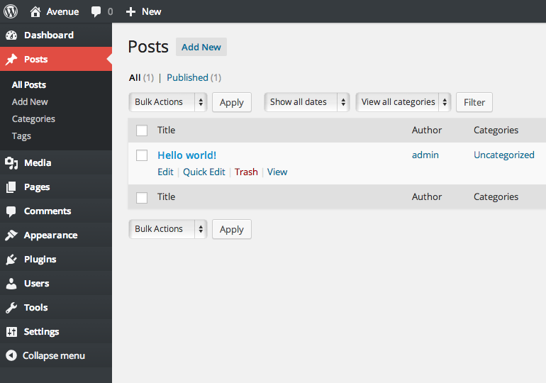
Can you spot the differences in the screenshot below? The plugin adds a more tactile view to the sidebar and makes some subtle changes in typography and spacing.

His plugin also makes some broad stroke changes to the .widefat class, as you can see on the posts screen:
If you’ve had similar thoughts about the new admin design, the Admin Interface by Avenue Factory might be an option to explore for housing some of your own custom tweaks.
Even if you don’t think that the WordPress admin needs a more tactile appearance, it’s cool to see the freedom designers and developers have to make changes with just a simple CSS file. Since millions of people are using WordPress, it’s likely that more alternatives to the admin design will pop up. Personally, I prefer the default interface as it currently ships with 3.8, but not everyone perceives colors, space and balance in the same way. We’re lucky that with WordPress you’re never locked into the default.

I’m with you Sarah.
I like the new interface so I’m not likely to make any changes.
I prefer to spend time on writing content and making the front end look good rather than looking for the perfect dashboard.